How to build your first offline eval
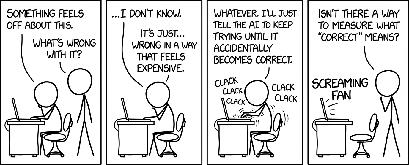
Imagine you're working on an AI system and something feels off. It's not performing the way you want it to, and the developer in you knows there has to be a way to measure it and make it better.
That instinct is correct, but the challenge is knowing where to start. Most developers haven't written an eval before, and don't know how to turn that feeling into measurement. You might know the concepts of datasets, scorers, prompts, and SDKs, but what order do you even do this in?
This guide shows you how to go from just a "vibe" to a working eval in 10 steps.
Running example: Mermaid diagram generation
I spent two days building an eval to improve Mermaid CLI diagram quality. Mermaid is a tool that generates diagrams from text descriptions, which makes it useful for automatically creating architecture diagrams or conceptual flowcharts. The problem is that when I prompt an LLM to generate a Mermaid diagram for me, it doesn't always look great. Sometimes it's too stretched, hard to read, or overly simplified or complex.
After building the eval, I had a repeatable system that measured aspect ratio, complexity, and render success across 11 prompt versions and 70 experiments.
The examples in this post are pulled directly from that project, but the framework applies to any AI system you're trying to improve. By the end of this guide, you'll have an eval that lets you evaluate your "vibe" systematically.
Step 1: Identify your system and the initial feeling
Start by defining what the system is that you want to evaluate.
What is your system? Here are some examples:
- Agentic chatbot: customer question → LLM searches company docs → outputs a customer-facing response
- CLI coding agent: developer asks for bug fix → LLM searches for where logic lives → writes a fix
- Video summarizer: video → LLM transcribes what's happening in video → outputs concise summary
- Retrieval system: user query → LLM embeds and searches vector database → returns relevant documents
What is the "vibe" you're feeling about this system?
- Curiosity: Want to understand how well it's actually performing
- Frustration: It's performing badly and you want it to do better
- Comparison: Need to choose between models or approaches
Step 2: Turn the feeling into a clear question
The problem is, you can't measure "frustration." You need to turn your feeling into a specific type of question, which will inform how to shape your eval.
Here are six question buckets that cover most eval work:

For my Mermaid diagram project, I started in Bucket 2. The bucket you're in determines what you need next: dataset shape, scorers, and how you interpret results.
Step 3: Build a tiny dataset
A lot of people think they need a huge dataset to get started. That's fair if you've already perfected your eval and you just want to scale it up to production. But when you're just starting out, a dataset of five examples is sufficient. You're usually going to find things to iterate on from those five alone.
There are two types of datasets:
- Input-only: "Describe the architecture of SWE-bench-Live"
- Input with an expected output: "What is 2+2?" → "4"
For my Mermaid diagram project, I used input-only. I picked five representative prompts that fell into two buckets:
- Architecture diagrams for codebases (3 examples): SWE-bench-Live, GraphRAG, and a simple personal ML/web scraping pickleball-related project.
- Conceptual summaries from blog posts (2 examples): A hierarchical breakdown of the five pillars of AI evaluation, and a diagram explaining this bash blog.
Here's what one of the prompts looked like:
Create an architecture diagram for SWE-bench-Live, a continuously updated benchmark for evaluating AI systems on real-world software engineering tasks.

The system has these main components:
1. Automated Curation Pipeline - scrapes GitHub for issues and PRs, filters candidates, validates test cases, generates task instances
2. RepoLaunch - an LLM-based agentic tool that automatically sets up containerized execution environments for any GitHub repo
3. Evaluation Harness - runs agent patches against test suites in Docker containers, reports pass/fail
4. Dataset (hosted on HuggingFace) - contains task instances with issue descriptions, test files, and gold patches
5. Leaderboard - tracks agent performance (resolve rate) across different models and scaffolds

Show data flow from GitHub repos through curation to evaluation.
These five examples hit different layout challenges in the Mermaid CLI tool: vertical chains, 1-to-many fan-outs, nested subgraphs, and wide hierarchies.
I figured this was enough to start seeing patterns. Once I could successfully get good diagrams for these five data points, I could expand to more. But it didn't make sense to build out a whole dataset yet.
Step 4: Define your scorers
One question usually has multiple dimensions. For example, "is this output good?" is never one thing. It could mean:
- Is it fast?
- Is it cheap?
- Is it accurate?
- Is it safe?
- Is it readable and usable?
- Is it consistent?
To start codifying these dimensions, I recommend starting with side-by-side examples. Look at your best output versus your worst output and write down what's wrong and right.


For Mermaid diagrams, I identified three dimensions:
- Aspect ratio: Is the diagram roughly square, or is it stretched into a tall or wide rectangle?
- Complexity: Does it show enough detail to be useful, or is it oversimplified?
- Render success: Does the Mermaid CLI successfully render it without syntax errors?
For more complex systems, you almost never want one score. You want a small set of scores that represent the different ways something can be "good." Each dimension gets a scorer.
Step 5: Implement your scores
Now that you have your dimensions, you need to decide how to measure each one. There are three types of scorers:
Type 1: Deterministic scoring
Use this when the thing you're measuring is objective and doesn't require human taste. You're looking at things like math calculations, parsing results, regex matches, runtime performance, cost tracking, or schema validity.
For example, from my Mermaid diagram eval, these two scorers were deterministic:
- Aspect ratio: Render the diagram to PNG, detect content bounds (exclude the background), calculate the width and height ratio, then score how close it is to 1:1.
- Render succeeded: This was a Boolean check. Did Mermaid CLI return a valid PNG or throw a syntax error?
Deterministic scorers are defined by code. My aspect ratio scorer looked like this (simplified):
def aspect_ratio_scorer(output, expected):
    if not output.get("rendered"):
        return 0.0

    # Detect content bounds (exclude background)
    left, top, right, bottom = get_content_bounds(image_base64)
    content_width = right - left
    content_height = bottom - top

    # Penalize vertical diagrams more than horizontal (asymmetric penalty)
    if content_height > content_width:
        ratio = content_height / content_width
        score = 1.0 / (ratio * 1.3)  # 30% stronger penalty for vertical
    else:
        ratio = content_width / content_height
        score = 1.0 / ratio

    return score
Using this deterministic scorer, I could see that my prompt v8 scored 45% on aspect ratio, while v10 scored 50% (more on prompt versioning in Step 6).
This gave me a systematic way to measure whether my prompt changes were actually improving the aspect ratio of my diagrams.
Type 2: LLM-as-judge scoring
Use this when you need qualitative judgment, like:
- Whether an AI-generated explanation is clear or confusing
- If the tone of a response matches your brand voice
For Mermaid, I needed to measure diagram complexity: whether the diagram was detailed enough to be useful, but not so dense that it became overwhelming.
I initially tried measuring this with a deterministic scorer using "ink coverage" (the percentage of non-background pixels in the rendered image). But the problem is that ink coverage measures pixel density, not information quality. For example, a diagram crammed with tiny text everywhere would score high on ink coverage but be completely useless to read. What I actually cared about was whether the diagram showed the right level of detail.
So instead, I switched to LLM-as-judge with a 0-10 rubric:
- 0-3 (Too simple): Only high-level categories, no grouping, and missing important components.
- 4-6 (Adequate): Has major components with some subcomponents, with at least 2 levels of hierarchy.
- 7-9 (Good): Has major components AND key subcomponents, with at least 2-3 levels of hierarchy and 15-30 nodes.
- 10 (Too complex): Every tiny detail is shown, and there is too much information.

I mapped 7-9 to a 0.9-1.0 normalized score. Scores below 7 got penalized for being too simple. A score of 10 got penalized for being overly complex.
Type 3: Human review scoring
Use human review scoring when the metric is inherently human. This includes:
- Preferences where taste matters. For example, when looking at music quality, does this sound good? When looking at art, does this look beautiful?
- Expert domains where subtle correctness is hard to automate. For example, when considering a diagnosis, is this appropriate given the constraints? When looking at a legal brief, does this address all the key arguments?
- Audience calibration. For example, when considering a 5th grader as the audience, is this course understandable?
For Mermaid, if I were to add human review, I could potentially use it for visual clarity. In other words, when looking at the diagram, is this actually readable, or is the layout broken in subtle ways that metrics miss?
I didn't do human review for this project, just because I thought the first two scorer types were good enough for now, and I wanted to focus on calibrating those two scorers first.
Step 6: Iterate, iterate, iterate
Think of each prompt version as a hypothesis you're testing. Every run is an experiment, and every regression is a signal telling you something about your system. Over two days, I ran 11 prompt versions and accumulated 70+ experiments. That might sound like a lot, but iteration is where the real work happens. I've had other projects that take ~20 minutes per run due to the amount of traces. Don't be surprised if this phase spans days or even weeks, especially when you're learning what works. Here's what I learned along the way:
Version your prompts explicitly
Don't rely on vague experiment names like "latest" or "fixed_v2". Use clear version labels.
My prompt file had a dictionary with version keys:
PROMPT_VERSIONS = {
    "v1_aspect_ratio_strict_simplicity": {
        "created": "2026-02-10",
        "notes": "Aspect ratio focus with strict simplicity limit (max 8-10 nodes).",
        "prompt": "..."
    },
    "v2_complexity_balanced": {
        "created": "2026-02-10",
        "notes": "Balance aspect ratio with adequate complexity; avoid over-simplifying.",
        "prompt": "..."
    },
    # ... v3 through v11
}
This made it easy to compare v8 vs v10 or revert to v5 when v6 failed.
Name experiments clearly
In Braintrust, my experiment names were: prompt_v8_gpt-5-a3f2c1, not prompt_current-x9k4m2. Clear names make it easy to see which prompt version each experiment used.
Change one major thing per version (when possible)
My v8 prompt introduced a rule that stipulates when a node has 3+ children, make the children's internal flow perpendicular to the parent direction. My v10 prompt refined semantic shapes, like having cylinders instead of rectangles for databases.
When a version regressed, I knew exactly what caused it. For example, one version's render success dropped to 0% because I tried implementing nested direction overrides (using direction LR inside a subgraph that was already inside another direction LR subgraph). Mermaid CLI doesn't support nested direction overrides, so it threw parsing errors on every diagram.
Try different phrasings of the same hypothesis
Sometimes a hypothesis causes a regression, but you're pretty sure the hypothesis itself is correct. In those cases, it might be about how the prompt is written or phrased. This is where you try different prompt variations to experiment with different phrasings of the same core idea. For example, I tried three different ways to express "balance horizontal and vertical flow" before finding phrasing that actually worked.
Step 7: Use AI to speed up the iteration loop
Once you have a baseline eval set up, set clear goals for your scores. For Mermaid, I wanted to hit at least 60% on aspect ratio and complexity, and 100% on render success.
The basic loop is: run an experiment, identify the data points that didn't do well, iterate on the prompt or system, and try again and again and again... until you hit your score goals. When I needed to step away for the afternoon but wanted to keep making progress, I used AI to automate this loop.
Braintrust's MCP server (or Loop) let me:
- Pull failing data points from experiments
- Inspect traces and logs
- Suggest prompt and system fixes based on patterns
- Generate the next version automatically
The iteration loop looks like this:

For example, when I asked Loop to analyze failing data points, it returned:
Diagrams with aspect_ratio_scorer below 70%:

| Diagram | Score | Dimensions | Ratio | Pattern |
|---------|-------|------------|-------|----------|
| SWE-bench-Live | 22.7% | 1349×5936 | 4.4 | Vertical stacking with LR subgraphs |
| 5 Pillars | 28.3% | 3879×1096 | 3.54 | Too many horizontal subgraphs |
| DUPR Tool | 33.6% | 1940×5773 | 2.98 | Sequential LR subgraphs stacked |

Root cause: Using `direction LR` in every subgraph forces horizontal
expansion. When flowchart TD stacks these, you get extremely tall or
wide outputs.

Recommendation: Avoid forcing LR in every subgraph. Use natural flow
direction and balance horizontal vs vertical organization.
Instead of staring at outputs for 30 minutes, I could use AI to get a suggestion in 2 minutes that becomes my next hypothesis. I then had my next experiment implement this feedback and try again.
Step 8: Get your hands dirty
Be careful about becoming too dependent on AI, because AI suggestions eventually plateau. You'll know you've hit that point when your scores aren't improving. When you see this pattern, you need to stop relying on AI, think through the problem yourself, and go deep on one example.
For example, I kept tweaking my prompt to add more padding between elements or position specific subgraphs in certain locations, but the diagrams kept ignoring this feedback. I sat down with an agent and asked it to explain how Mermaid CLI actually works: the terminology, how it organizes nodes, and the underlying layout model. I learned that I was hitting Mermaid CLI's constraint surface. Essentially, Mermaid doesn't allow you to explicitly position where the subgraphs are going to be, which is what I was asking my prompt to do.
Once I understood Mermaid's constraints, I adjusted my strategy. Instead of trying to force perfect aspect ratios everywhere, I focused on balancing horizontal and vertical flows within the degrees of freedom I actually had. The v8 prompt codified this with a "recursive 1-to-many balancing" rule:
KEY PRINCIPLE - RECURSIVE 1-TO-MANY BALANCING:
When you have a 1→many fan-out (one parent with 3+ children), those children
spread PERPENDICULAR to your flow direction. To balance this, make the
children's INTERNAL flow go the OPPOSITE direction.

RULE:
1. If top-level has 1→many fan-out (e.g., Parent → 5 subgraphs):
   - Those subgraphs spread HORIZONTALLY (perpendicular to TD)
   - Inside each subgraph: use "direction LR" to flow horizontally
   - This makes each subgraph wider to balance the horizontal spread

2. If inside a subgraph there's another 1→many (e.g., SubParent → 5 nodes):
   - Those nodes spread VERTICALLY (perpendicular to LR)
   - If nesting further: use TD or no direction (inherit default)
   - This makes nested content taller to balance the vertical spread
Here, TD stands for Top-Down (flow goes vertically), LR stands for Left-Right (flow is horizontal), and subgraph refers to a section that groups related nodes. I only had an understanding of the terminology and way Mermaid CLI works because I stopped to get my hands dirty and understand things.
This gave the model a clear framework: when things spread one direction, make their internals flow the opposite direction. This improves aspect ratio by preventing tall, narrow or short, wide graphs that spread too far in one direction.
Step 9: Watch for trade-offs
You have to watch for overfitting when you're iterating on a specific dataset. It's easy to accidentally game the system.
| Version | Aspect Ratio | Complexity (LLM) |
|---|---|---|
| v8 | 45% | 97% |
| v9 | 80% | 27% |
As you can see above, prompt v9 improved aspect ratio by 35%, but dropped the complexity score by 70%, meaning the diagrams became too simple.
This is why multi-score evaluation prevents you from optimizing the wrong thing. If I'd only measured aspect ratio, I might have shipped v9 and wondered why people complained the diagrams were useless.
Step 10: Deal with variance and nondeterminism
Even with the same prompt and the same dataset, you can get different outputs. Variance of 20% or more is real, especially at higher temperatures.
For example, earlier runs at temperature 0.7 showed significant variance:
| Run | Aspect Ratio | Complexity |
|---|---|---|
| 1 | 42.3% | 89.2% |
| 2 | 48.7% | 91.5% |
| 3 | 39.1% | 78.4% |
That's a 10% swing in aspect ratio and 13% in complexity across three identical runs. Here's what I got when I ran v8 three times at temperature 0.0:
| Run | Aspect Ratio | Complexity |
|---|---|---|
| 1 | 45.05% | 96.60% |
| 2 | 45.05% | 96.60% |
| 3 | 45.05% | 96.60% |
I don't suggest always running at temperature 0.0 because you want to allow for some creativity in the model's answers, but keep in mind that reproducibility is important when you're trying to ship an eval to production. Here are my tips around this:
- Reduce temperature: Temperature 0.0 gives deterministic outputs for GPT models. Use this when you're comparing prompt variants and need consistent comparisons.
- Repeat runs for "contenders": Before shipping a prompt version, I ran it 3x to verify it wasn't a fluke.
- Don't ship based on a lucky run: If v10 scored 50% once and 40% twice, the real performance is 40%.
Conclusion
Building this eval took longer than I expected, but the payoff was worth it. Before, every time I asked my LLM to generate a diagram using Mermaid CLI, the output quality was unpredictable. If it didn't look good, I didn't understand why the diagram was bad or how to fix it.
Now I get consistently better Mermaid CLI diagrams, and I have a system that I can tweak to systematically improve my outputs.
Ready to build your first eval? Get started with Braintrust for free.