

Custom charts are only available on Pro and Enterprise plans.
Create a chart
On a dashboard you created, click Chart to open the chart editor. To change an existing chart, click the icon on the chart itself. Where SQL charts are available, Chart opens a new SQL chart on dashboards that aggregate logs. To use the structured editor described on this page, click the caret next to Chart and select Structured chart. Charts can only be added to dashboards you create. To add charts to the built-in Cost and quality dashboard, clone it first.Chart editor options
-
Chart type: Determines the visualization and which other options are available:
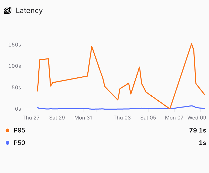
- Time series: Plot metrics over time as lines or stacked bars. Time series charts help you spot trends, anomalies, and correlations.
Show screenshot
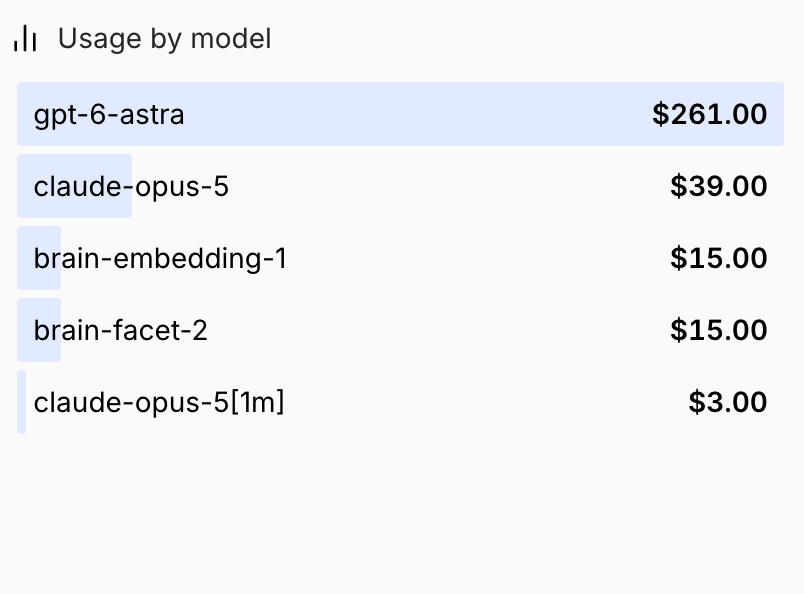
- Top list: Rank groups by a metric over the selected timeframe. Order by value or alphabetically, ascending or descending.
Show screenshot
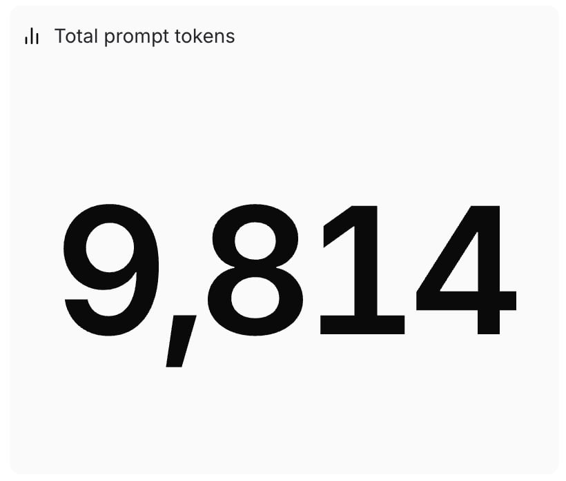
- Big number: Display a single aggregate value as one large number. Useful for highlighting key metrics like total requests or average score.
Show screenshot
- Time series: Plot metrics over time as lines or stacked bars. Time series charts help you spot trends, anomalies, and correlations.
-
Presets: Start from a built-in chart covering common metrics like request count, latency, token usage, and scores. Select the Presets tab to pick a preset.
Show screenshot
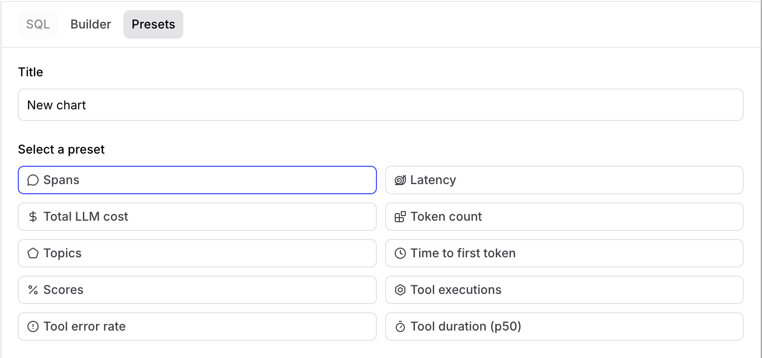 Some preset charts (Spans, Latency, Total LLM cost, Token count, and Time to first token) automatically exclude internal scorer spans generated by online scoring automations such as Topics and online scorers. This ensures the metrics reflect actual production traffic rather than scoring overhead. Custom charts include all spans by default. Add a
span_attributes.purpose is null or span_attributes.purpose != 'scorer'filter to replicate the same behavior. - Title: A label displayed above the chart.
-
Measures: What to plot. Select a SQL expression and aggregator (sum, avg, min, max, count, count distinct, or percentile), or select
</>to enter a full SQL aggregate expression such asavg(latency) / count_distinct(user_id)or100 * sum(errors) / count(id). Invalid expressions display a validation error on hover. Built-in measure types are also available for aggregate scores and cost. -
Filters: Narrow results by span or trace conditions:
- Span filter: Limits which individual spans contribute to the measure. Click Span filter to add one.
- Trace filter: Narrows results to traces where any span satisfies the filter conditions, useful for filtering by root-span metadata such as
metadata.email. To add one, open the more options menu () next to Span filter and select Trace filter. Existing trace conditions appear under a Trace filters (optional) subsection.
-
Group by: Split the chart into separate series by a SQL dimension, such as
metadata.model. Available for time series and top list charts. -
Options: Controls visualization-specific settings:
-
Unit type: Choose how values appear in chart axes, tooltips, and legends:
- Duration: Seconds (e.g., “1.5s”, “0.3s”).
- Cost: US dollars (e.g., “1.23”).
- Count: Generic countable things (e.g., “1,234”, “5.5”).
- Percent: Percentages (e.g., “75%”, “100%”).
- Bytes: Binary byte units using base-1024 (e.g., “1 KB”, “2 GB”, “500 B”).
- Visualization: Visualize as lines or bars. Available for time series charts only.
-
Target time interval: Set the time bucket size for time series charts. Choose Auto to let Braintrust pick bucket sizes based on the visible time range, or select Week, Day, or Hour to override the automatic choice. The selected interval is a target, not a guarantee. If it would produce buckets that are too small or too large to read at the visible time range, Braintrust falls back to the nearest readable bucket size. Available for time series charts only.
By default, buckets are assigned by
created(ingestion time). To usemetrics.start(event start time) instead, which is useful for projects that batch-ingest historical spans, see Configure Monitor chart time dimension. - Sort: Sort by value or name, ascending or descending. Available for top list charts only.
-
Unit type: Choose how values appear in chart axes, tooltips, and legends:
Performance warnings
As you configure a chart, Braintrust flags settings that are likely to make it slow. A warning appears next to the affected measure or filter, with an explanation of what to change. On a measure, the explanation also appears when you hover over the input. Group-by fields are checked as a set rather than individually. Saving a custom chart that still has warnings prompts you to confirm with Save anyway. Preset charts save without the prompt.Build charts with Loop
In the chart editor, click Loop agent to build or refine a chart with Loop. The chart is added to the conversation’s context automatically. When you send a message, Loop receives the chart’s configuration, including unsaved edits, and the editor’s selected time range. Remove the chart’s context badge to stop including its configuration in your messages. Example prompts:- “List the top 5 models by error rate over the last 7 days.”
- “Show error rate over time for Claude models.”
- “Display average latency grouped by user.”
- “Chart token usage trends for the past month.”
Add notes
Notes are Markdown cards that sit alongside charts on a dashboard. Use them to explain what a dashboard tracks, link to runbooks, or annotate a group of charts.Notes are only available on Pro and Enterprise plans.
- Click the caret next to Chart and select Note.
- Write the note in the Markdown text area. A live preview appears next to it.
- Click Save as new, or press
Cmd+Enter(macOS) orCtrl+Enter(Windows and Linux).
Move and copy charts
Hover over a chart and click the more options menu () to access the following options:- Export to dashboard: Copy the chart to a different dashboard in the same project or another project. In the dialog that opens, pick the destination project and dashboard, then click Add chart. The built-in Cost and quality dashboard can’t be a destination.
- Copy link: Copy a shareable link to the chart. The link opens the chart in fullscreen mode.
- Copy config: Copy the chart’s or note’s configuration to your clipboard. Paste it on any dashboard to add it there.
- Open in SQL sandbox: Open the chart’s underlying query in the SQL sandbox for further exploration.
Organize charts into sections
Group related charts into named sections to keep a long dashboard readable. Sections can be renamed, reordered, collapsed, duplicated, and deleted on dashboards you create.Sections are only available on Pro and Enterprise plans.
- Select one or more charts, then click Section in the selection bar to group them.
- Click the caret next to Chart and select Section to start an empty section, then add charts to it afterward.
- Rename it: Click the section title and edit it in place.
- Reorder it: Drag the handle in the section header to move the section and its charts.
- Collapse or expand it: Click anywhere on the section header, or the button, to hide or show its charts. Braintrust remembers each section’s collapsed state in your browser, so it persists across page reloads. Duplicating a section keeps its collapsed state.
- Duplicate or delete it: Hover over the section header, open the Section options menu, and choose Duplicate or Delete. Deleting a section leaves its charts on the dashboard.
Export chart data
Hover over a chart, open the more options menu (), and select Export data to download the chart’s underlying data:- JSON: Download the data as a JSON file.
- CSV: Download the data as a CSV file.
Delete charts
Hover over a chart, open the more options menu (), and select Delete to remove it from the dashboard. Charts can only be deleted from dashboards you create, not from the built-in Cost and quality dashboard.Next steps
- Filter and group data across every chart on a dashboard.
- Copy a dashboard to another project once you have a set of charts worth reusing.
- Read the SQL reference to write more advanced measures and filters.
- Score online to add quality metrics you can chart.