View results
To view the results of an experiment, go to Experiments in your project and select the experiment from the list.-
Traces vs. spans - By default, experiments display as a table of traces where each row represents a complete trace with its root span. To view the individual spans in traces instead, select Display > Row type > Spans.
View individual spans when you want to:
- Analyze specific operations within traces
- Find particular function calls or API requests
- Examine timing and token usage for individual operations
Spans view is optimized for analyzing individual operations. Experiment comparisons and diff mode are only available when viewing traces. - Metrics - Along with the scores you track, Braintrust tracks a number of metrics about your LLM calls that help you assess and understand performance. For example, when you switch models, it’s useful to look at duration, token metrics, and estimated cost together to understand the tradeoffs. To compute LLM metrics like token counts, make sure you trace your LLM calls.
-
Experiment summary - Select Details to view:
- Comparisons to other experiments
- Scorers used in the evaluation
- Datasets tested
- Saved parameters linked to the evaluation
- Metadata like model and parameters
Filter results
Each project provides default table views with common filters for experiments, including:- Default view: Shows all traces in the experiment
- Non-errors: Shows only traces without errors
- Errors: Shows only traces with errors
- Scorer errors: Show only traces with scorer errors
- Unreviewed: Hides traces that have been human-reviewed
- Assigned to me: Shows only traces assigned to the current user for human review
metadata query parameter on GET /v1/experiment. See Filter experiments by metadata for details.
Group results
Select Display > Group by to group the table by metadata fields to see patterns. By default, group rows show one experiment’s summary data. To view summary data for all experiments, select Include comparisons in group.Order by regressions
Score and metric columns show summary statistics in their headers. To order columns by regressions, select Display > Columns > Order by regressions. Within grouped tables, this sorts rows by regressions of a specific score relative to a comparison experiment.Examine a trace
Select any row to open the trace view and see complete details:- Input, output, and expected values
- Metadata and parameters
- All spans in the trace hierarchy
- Scores and their explanations
- Timing and token usage
When comparing experiments with diff mode enabled, only the default trace view is available. Timeline, Thread, and custom views are disabled during comparison.
Assign for review
You can assign experiment rows to team members for review, analysis, or follow-up action. Assignments are particularly useful for human review workflows, where you can assign specific rows that need human evaluation and distribute review work across multiple team members. See Assign rows for review for details.Score retrospectively
Apply scorers and classifiers to existing experiments:- Multiple cases: Select rows and use Score to apply chosen scorers and classifiers
- Single case: Open a trace and use Score in the trace view
Analyze with Loop
Use Loop to analyze experiment results, identify patterns, and get improvement suggestions. Loop can help you understand why certain test cases succeeded or failed and generate actionable recommendations. Select one or more experiments and open Loop to:- Summarize results: Get high-level insights about experiment performance, score trends, and key differences between experiments.
- Drill into specific rows: Ask Loop to analyze test cases that performed poorly or identify patterns across failures.
- Generate improvements: Loop can suggest changes to prompts, scorers, or datasets based on experiment results.
- Create datasets: Extract problematic or interesting test cases into new datasets for targeted evaluation.
- Generate code: Get sample code for implementing improvements to test in your next experiment.
- “What improved from the last experiment?”
- “Categorize the errors in this experiment”
- “Pick the best scorers for this task”
- “Why did the factuality score drop?”
- “Create a dataset from the rows where the model failed”
- “What patterns do you see in the low-scoring cases?”
Use aggregate scores
Aggregate scores are formulas that combine multiple scores into a single metric. They are useful when you track many scores but need a single metric to represent overall experiment quality. See Create aggregate scores for more details.Download results
To download an experiment’s results, select and then Download as CSV or Download as JSON.Customize the experiments table
Adjust table layout
To switch between different layouts, select Display > Layout and one of the following:- List: Default table view
- Grid: Compare outputs side-by-side
- Summary: Large-type summary of scores and metrics across all experiments
- Summary table: Scores and metrics as rows with experiments as columns, with a PDF download option.
Show and hide columns
Select Display > Columns and then:- Show or hide columns to focus on relevant data
- Reorder columns by dragging them
- Pin important columns to the left
Create custom columns
Extract specific values from traces using custom columns:- Select Display > Columns > + Add custom column.
- Name your column.
- Choose from inferred fields or write a SQL expression.
Create custom table views
To create or update a custom table view:- Apply the filters and display settings you want.
- Open the menu and select Save view… or Save view as….
Custom table views are visible to all project members. Creating or editing a table view requires the Update project permission.
Duplicate table views across projects
If you’ve built a useful custom table view in one project, you can duplicate it to another project via the API rather than recreating it from scratch. Experiments have two customizable views:- Experiments list: The project’s Experiments tab, where each row is a experiment.
- Single experiment table: The rows of data inside one experiment.
view_type in the API call.
-
Use the list views API endpoint to fetch the experiment views in your source project. Pass the following query parameters:
object_type=projectobject_id=<source-project-id>view_type=experimentfor a single experiment table view, orview_type=experimentsfor the experiments list
-
In the response, find the view you want to duplicate and copy its
view_dataandoptionspayloads. -
Use the create view API endpoint to create the view in the destination project. Set
object_idto the destination project ID.
Set default table views
You can set default views at three levels:- Organization default: Visible to all members when they open the page. This applies per page. For example, you can set separate organization defaults for Logs, Experiments, and Review. To set an organization default, you need the Manage settings organization permission (included by default in the Owner role). See Access control for details.
- Project default: Overrides the organization default for everyone viewing this project. To set a project default, you need the project-level Update permission. Project admins can set project defaults even without organization-level permissions. See Access control for details.
- Personal default: Overrides the project and organization defaults for you only. Personal defaults are stored in your browser, so they do not carry over across devices or browsers.
- Switch to the view you want by selecting it from the menu.
- Open the menu again and hover over the currently selected view to reveal its submenu.
- Choose Set as personal default view, Set as project default view, or Set as organization default view.
- Open the menu and hover over the currently selected view to reveal its submenu.
- Choose Clear personal default view, Clear project default view, or Clear organization default view.
Change the table density
To change the table density to see more or less detail per row, select Display > Row height > Compact or Tall.Export experiments
- UI
- SDK
- API
- CLI
To export an experiment’s results, open the menu next to the experiment name. You can export as CSV or JSON, and choose whether to download all fields.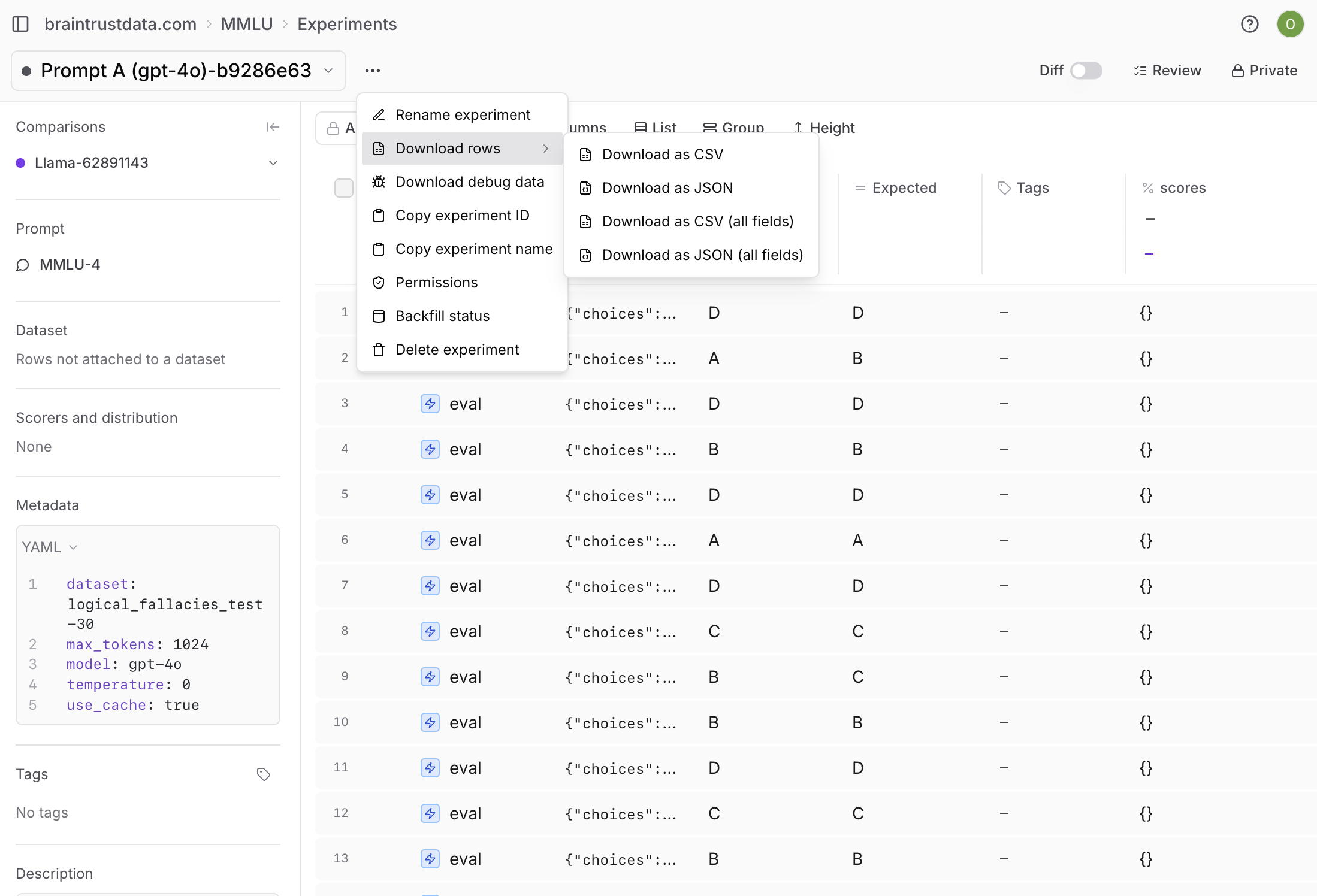
Share an experiment
Experiment URLs are name-based, so a shared link breaks when the experiment is renamed. A permalink uses the experiment’s object ID instead, so it stays valid permanently. Use permalinks to share results, bookmark experiments, or include stable links in reports. To copy a permalink, use the permalink button in the experiment view. You can also construct one by hand from the experiment’s ID:Next steps
- Compare experiments systematically
- Write scorers to measure what matters
- Use playgrounds for rapid iteration
- Run evaluations in CI/CD